

How to Avoid Color Shifts in Sublimation Printing
Table of Contents
- Why Color Shifts Happen in Sublimation Printing
- Start With the Right ICC Profile for Sublimation
- Step 1: Calibrate Your Monitor and Printer
- Step 2: Set the Correct Sublimation Heat Press Temperature Settings
- Step 3: Control Moisture and Humidity Around the Press
-
Step 4: Match Your Substrate and Ink Type
- Hard Goods vs. Soft Textiles: Two Different Shift Worlds
- Polyester Content: The Dominant Variable on Textiles
- Hard Goods Coating Chemistry and Pre-Treatment
- Hard Goods vs. Textiles: Temperature and Time Adjustments
- The Unique Angle: Substrate-Specific Shift Logs
- Sublimation Ink vs Pigment Ink: Which One Shifts Less?
- Troubleshooting Common Color Shift Problems
- Conclusion: Build a Repeatable Color Workflow
- Frequently Asked Questions
Last Updated: September 6, 2026
Color shifts in sublimation are the difference between a print that looks like your screen and one that looks like a faded, muddy version of it. This guide from Printer Ink Pro walks through the systematic fixes that eliminate the guesswork, covering ICC profiles, heat press settings, humidity control, and substrate matching.
Why Color Shifts Happen in Sublimation Printing
A color shift in sublimation printing is any visible difference between your digital design and the final pressed product. These shifts rarely trace back to a single failure; they usually stack. The most common culprits are a mismatched ICC profile, incorrect heat press temperature settings, and moisture trapped in the paper or fabric.
The physics of dye sublimation compounds the problem. Your printer lays down dye in a CMYK or RGB color space, but the heat press converts that dye into a gas that bonds with polyester. If the dye doesn't fully sublimate because the temperature is too low, you get dull, washed-out colors. If it's too high, you get bleeding and halos.

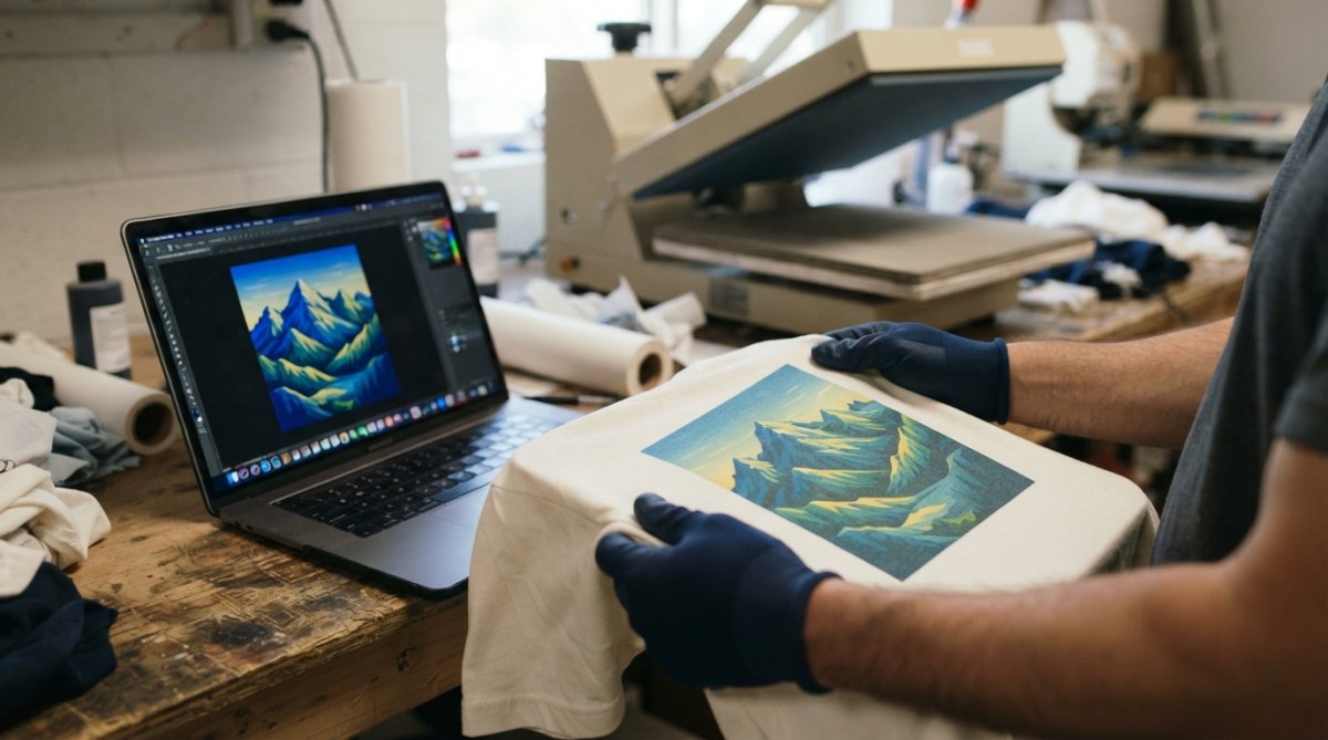
The shift pattern changes with every variable, which is why random tweaking fails. A systematic workflow that controls each variable independently is the only reliable fix.
Start With the Right ICC Profile for Sublimation
The ICC profile for sublimation is the single highest-impact tool for color accuracy. It tells your software how your specific printer, ink, and paper combination reproduces color, then converts your image's color values into the correct ink densities.
Using a generic profile or, worse, no profile at all, forces your printer to guess. The result is predictable: oversaturated reds, muddy skin tones, and a color gamut that doesn't match your monitor.
An ICC profile for sublimation must match three things simultaneously: your exact printer model, your exact ink formulation, and your exact transfer paper. Change any one of these and the profile is invalid. Many shops run the same printer but switch paper brands and wonder why colors suddenly shift. This is why.
Soft proofing in your design software is the quickest way to check a profile before you waste a sheet. Most professional programs let you preview how the final print will look using the profile's color gamut. If the preview looks wrong, the profile is wrong.
Step 1: Calibrate Your Monitor and Printer
Monitor calibration is the foundation because you cannot fix what you cannot see. A monitor that runs too bright or too blue will have you compensating by printing darker or warmer, which throws every other variable off. But calibration alone is not enough, you need a closed-loop workflow that includes soft proofing before you ever press a sheet.
Hardware Calibration: The Non-Negotiable Baseline
A hardware calibrator is the right tool here. Software-only adjustments rely on your eyes, which adapt to whatever they're looking at. A calibrator measures the actual output and builds a display profile in minutes. Recalibrate monthly, since monitor phosphors and backlights drift over time.
Set your monitor to a white point of D65 (6500K) and a gamma of 2.2, which is the standard for most design work in the United States. A brightness of 120 cd/m² is a common starting point for print production.
Printer Calibration: Beyond the Nozzle Check
Printer calibration starts with a nozzle check. Clogged or weak nozzles produce banding and color shifts that no ICC profile can correct, because the printer isn't laying down the intended ink density. Run a nozzle check before every production run, and clean the print head if you see gaps.
But nozzle health is only the first layer. For true repeatability, verify that your printer is laying down ink density consistently across the entire platen width. Print a solid cyan or magenta block across the full width of your paper. If the density is visibly lighter on one edge, your print head alignment or ink flow is off. Most Epson printers used in sublimation have a head alignment utility in the driver, run it after any ink cartridge change or if you see banding.
Soft Proofing: The Missing Step Most Shops Skip
Soft proofing is where you catch color shifts before wasting a sheet of transfer paper. In Adobe Photoshop, go to View > Proof Setup > Custom, then select your sublimation ICC profile. Set the rendering intent to Perceptual for photographic images or Relative Colorimetric for logos and flat graphics. Check the box for "Simulate Paper Color" and "Simulate Black Ink" to see how the final print will look on your specific substrate.
A common pattern is that the soft proof looks slightly duller than the screen image, that's expected, because the proof is showing you the gamut of your printer and paper combination. The goal is not to match your screen exactly; it's to see whether the shift is acceptable before you print.
If the soft proof reveals a significant shift, for example, skin tones turning green or reds losing their punch, you have two options. First, verify that your ICC profile actually matches your current ink and paper lot. Second, consider whether your image is in the correct color space. Sublimation workflows in the United States typically use sRGB for web-sourced images and Adobe RGB (1998) for higher-end photography.
Building a Test Target That Actually Tells You Something
Print a test image with known color values, then compare it to your soft proof. The test target should include skin tones, neutral grays, and saturated primaries, since those reveal shift patterns fastest. But go beyond the basic target: include a 10-step gray ramp from pure white to pure black. Gray ramps expose color casts that are invisible on colorful images. If the gray ramp shows a magenta or green tint, your printer is not neutral, this points to an ink density issue or a profile mismatch.
Print this test target at the start of each week, then again after any change to ink, paper, or environmental conditions. File the results in a binder or a digital folder. When a color shift appears later, you can compare against your baseline to isolate which variable changed.
The Unique Angle: Soft Proofing as a Client Communication Tool
Most troubleshooting guides stop at "calibrate your monitor." But soft proofing has a second use that saves you from reprints: client communication. When a client approves a design on screen, they are approving a version that has not been soft proofed. Send them a soft-proofed PDF that simulates the final sublimation output. This sets expectations before you press, reducing the chance of a dispute over color after the order ships.
Step 2: Set the Correct Sublimation Heat Press Temperature Settings
Sublimation heat press temperature settings vary by substrate, but the underlying principle is constant: the dye must fully vaporize and bond without degrading. Most polyester fabrics and coated hard goods press between 380°F and 400°F for 45 to 60 seconds.
Pressure settings matter as much as temperature. Too little pressure leaves gaps where the dye can't transfer, producing light patches. Too much pressure can crush the fabric nap or cause dye migration into the substrate. A medium, even pressure across the whole platen is the safe starting point.
Dwell time is the third leg of this stool. Under-pressing leaves the dye partially un-sublimated, which looks like a color shift toward the original ink color. Over-pressing can cause the dye to spread beyond the intended area, creating halos and reduced sharpness.
Sawgrass's official sublimation temperature and time guide provides a solid baseline table for common substrates, but treat it as a starting point, not gospel. Your specific paper and ink combination may need adjustment.
Step 3: Control Moisture and Humidity Around the Press
Environmental humidity is the most overlooked cause of color shifts in sublimation. Transfer paper is hygroscopic, meaning it absorbs moisture from the air. When pressed, that moisture turns to steam and interferes with dye transfer, causing ghosting, light spots, and unpredictable color shifts.
The fix is boring but effective: store transfer paper in a sealed container with desiccant packs, and keep the press room between 40% and 60% relative humidity. A simple digital hygrometer costs little and removes an entire class of variables.
Moisture accumulation also happens inside unvented heat press platens. If you press for hours in a closed room, humidity climbs steadily. Ventilation or a dehumidifier keeps conditions stable across a long production run.
For the same reason, never press damp fabric. Pre-drying garments or substrates that have been stored in a humid environment prevents steam pockets that displace dye.
Step 4: Match Your Substrate and Ink Type
Different substrates accept dye sublimation at different rates, and that changes how colors land. A 100% polyester shirt takes dye differently than a 50/50 poly-cotton blend, and a hard-surface coated mug behaves differently again. But the shift patterns are not random, they follow predictable rules based on the substrate's physical structure.
Hard Goods vs. Soft Textiles: Two Different Shift Worlds
Hard goods, ceramic mugs, metal tumblers, aluminum panels, have a non-porous polymer coating that receives dye only at the surface. Soft textiles, polyester shirts, flags, sportswear, have fibers that the dye gas penetrates and bonds with internally. This single difference drives every other variable.
On hard goods, the dye has nowhere to go but into the coating. If your temperature is too low, the dye sits on the surface and looks hazy or washed out. If your temperature is too high, the dye can sublimate too quickly and blow back out of the coating, causing a lighter print with a visible halo. Hard goods also show shift patterns that are more sensitive to pressure: uneven pressure on a mug press creates a gradient where one side is darker than the other.
On soft textiles, the dye gas penetrates the fiber. The shift pattern here is driven by polyester content and fabric weave. A tight-weave performance fabric (like those used in athletic wear) accepts dye more evenly than a loose-knit shirt. The loose knit allows the gas to escape through gaps, producing a lighter print with less saturation.
Polyester Content: The Dominant Variable on Textiles
Polyester content is the dominant factor on textiles. Higher polyester content produces more vibrant, saturated colors because there's more polymer to accept the dye. Lower content leaves the dye with fewer bonding sites, producing washed-out colors and a visible shift toward the original ink hue. For best results, use at least 60% polyester, and ideally higher.
But there is a practical trade-off that most guides ignore: 100% polyester fabrics are often thinner and more heat-sensitive. Pressing a 100% poly shirt at 400°F for 60 seconds can cause the fabric to scorch or melt if the platen has hot spots. A 65/35 poly-cotton blend is more forgiving but will never match the color saturation of a 100% poly garment. Most professional shops in the United States standardize on 100% polyester for sublimation orders, then adjust temperature down to 380°F and dwell time to 45 seconds to protect the fabric.
Hard Goods Coating Chemistry and Pre-Treatment
Pre-treatment matters on hard goods. Some coated substrates need a wipe-down before pressing to remove oils and dust that block dye uptake. Skipping this step produces patchy, inconsistent color that looks like a shift but is actually a contamination problem.
The coating on hard goods is typically a polyester-based polymer that is sprayed or dipped onto the surface. The quality of that coating varies by manufacturer. A low-quality coating will absorb dye unevenly, producing mottled colors that no ICC profile can fix. If you are seeing consistent color shifts on one brand of mug but not another, the coating is the variable, not your printer or your profile.
A practical test: press the same design onto two different brands of white mugs using the same paper, ink, and settings. If the colors differ, the coating is the cause. This is a diagnostic step that most troubleshooting guides skip, but it isolates the substrate as a variable in minutes.
Hard Goods vs. Textiles: Temperature and Time Adjustments
Hard goods generally require a higher temperature and longer dwell time than textiles because the heat must penetrate the coating and the substrate wall. A standard mug press runs at 400°F for 60 seconds. A textile press runs at 380°F to 400°F for 45 to 60 seconds. But the shift patterns differ:
- Hard goods: If colors look too dark or muddy, reduce temperature by 10°F. If they look washed out, increase dwell time by 10 seconds before raising temperature.
- Textiles: If colors look dull, check polyester content first. If the fabric is 100% poly and still dull, raise temperature by 5°F increments. If you see ghosting, the paper shifted, not a temperature issue.
The Unique Angle: Substrate-Specific Shift Logs
Most guides tell you to keep a log of successful presses, but they do not tell you to log shift patterns by substrate. Start a spreadsheet with columns for substrate type, brand, coating or fabric composition, temperature, dwell time, pressure, and the specific color shift you observed (e.g., "reds turned orange" or "blues lost saturation"). After 20 to 30 entries, you will see patterns that no generic troubleshooting table can reveal. For example, you may find that one brand of tumbler consistently shifts greens toward yellow, while another brand shifts them toward cyan. That knowledge lets you pre-adjust your design file for that specific substrate, not by guessing, but by data.
Sublimation Ink vs Pigment Ink: Which One Shifts Less?
Dye sublimation ink shifts less than pigment ink during the transfer process, provided you use the correct ICC profile and heat settings. This is because sublimation dye bonds chemically with polyester fibers, while pigment ink sits on the surface and is not designed for heat transfer at all.
Pigment ink is for direct printing onto paper or fabric where it dries on the surface. It is not a substitute for sublimation ink. Using pigment ink in a sublimation workflow produces no gas phase, so the heat press simply bakes the pigment into the paper with almost no transfer to the substrate.
For consistent, repeatable color on polyester and coated hard goods, dye sublimation ink is the correct choice. Printer Ink Pro carries refillable dye sublimation ink cartridges for a range of Epson Expression printers, including the XP-330 and XP-340 and the XP-430 and XP-434 models, which pair with the ICC profiles for those specific printer and ink combinations.

Troubleshooting Common Color Shift Problems
When a shift appears, diagnose systematically rather than changing everything at once. Change one variable, test, and evaluate. The table below summarizes the most common problems and their root causes.
| Symptom | Likely Cause | Fix |
|---|---|---|
| Colors too dark or muddy | Incorrect ICC profile or over-inking | Re-profile, check ink density settings |
| Washed-out, low saturation | Temperature too low or low polyester content | Raise temperature, use higher poly fabric |
| Ghosting or double image | Paper shifting during press | Secure transfer paper with heat-resistant tape |
| Light patches or spots | Moisture in paper or fabric | Store paper with desiccant, pre-dry fabric |
| Banding across print | Clogged nozzles | Run nozzle check, clean print head |
| Colors bleed into each other | Temperature too high or over-pressing | Lower temperature, reduce dwell time |
A common mistake is adjusting the design file to compensate for a shift. If your prints come out too dark, editing the image to be lighter just masks the real problem, which is usually an incorrect ICC profile or an ink density setting that's too high. Fix the profile first.
Bleeding and ghosting are often confused, but they have different causes. Bleeding is color spreading beyond its intended area, usually from excessive heat or pressure. Ghosting is a faint secondary image, almost always from the paper shifting during the press. Heat-resistant tape solves ghosting; lower temperature settings solve bleeding.
Epson's official guidance on sublimation printing best practices reinforces that regular print head maintenance and correct profile selection are the two pillars of consistent output.
Conclusion: Build a Repeatable Color Workflow
Color shifts in sublimation printing are not random events; they are the predictable result of uncontrolled variables. The workflow that eliminates them is repeatable: calibrate your monitor, load the correct ICC profile for sublimation, verify nozzle health, control heat press temperature and pressure, manage humidity, and match your substrate.
The FreeColorConvert guide to ICC profiles and color management offers a deeper technical primer on how color spaces and rendering intents interact, which helps when you need to troubleshoot an unfamiliar shift.
The difference between a shop that fights color shifts and one that doesn't is rarely talent. It's process discipline. Each of these steps is simple; maintaining all of them consistently is the hard part. Start with the ICC profile, since it delivers the largest improvement for the least effort.
When you need dye sublimation ink that behaves predictably with a known ICC profile, Printer Ink Pro's refillable cartridge systems for Epson Expression printers deliver consistent, vibrant results at a fraction of OEM cost. Get started with Printer Ink Pro and build a color workflow you can trust on every order.
Frequently Asked Questions
Why are my sublimation colors not printing correctly?
The most common cause is a missing or incorrect ICC profile for sublimation. Your monitor and printer interpret color differently, so without a profile, the output won't match your screen. Other causes include wrong heat press temperature settings, excessive moisture in the paper or fabric, and using a substrate with low polyester content. Start by confirming your ICC profile matches your specific ink and printer model, then run a nozzle check to rule out clogged print heads.
Does heat press temperature affect sublimation color?
Yes. If the heat press temperature is too low, the dye won't fully convert to gas, resulting in dull, washed-out colors. If it's too high, the dye can oversaturate and cause bleeding or dark, muddy shifts. Follow the temperature range recommended for your specific ink and substrate. Follow the temperature range recommended for your specific ink and substrate.
How do I use ICC profiles to fix sublimation color shifts?
An ICC profile tells your software how to convert colors from your monitor's RGB space to your printer's CMYK space so the output matches your screen. To use one, install the profile, then select it in your design software's color management settings under the print dialog. Choose 'Perceptual' rendering intent for photographs and 'Relative Colorimetric' for logos and spot colors. Always pair the profile with the exact ink and paper combination it was built for.
How can I prevent ghosting when sublimating?
Ghosting happens when the transfer paper shifts during pressing or when moisture turns to steam and moves the dye. Secure the paper to your substrate with heat-resistant tape on all four corners. Before pressing, make sure both the paper and fabric are dry, and avoid pressing items that have been sitting in a humid room. Use a light tack spray if you're pressing large formats that are prone to slipping.